The BMW online configurator is a critical conversion point — the digital bridge between desire and dealership. This self-initiated redesign concept tackles three structural UX failures that were silently killing conversions: premature authentication, invisible inventory, and a fragmented journey that left buyers stranded before purchase.
Today, over 70% of car buyers research and configure their vehicle online before setting foot in a dealership. The BMW configurator isn't just a product page — it's the primary sales instrument for one of the world's most premium automotive brands.
A poor experience here doesn't just create frustration. It creates abandoned journeys, missed sales, and eroded brand trust. This concept redesign was driven by a heuristic audit of the live configurator, identifying where the experience contradicts BMW's core brand promise: Sheer Driving Pleasure.
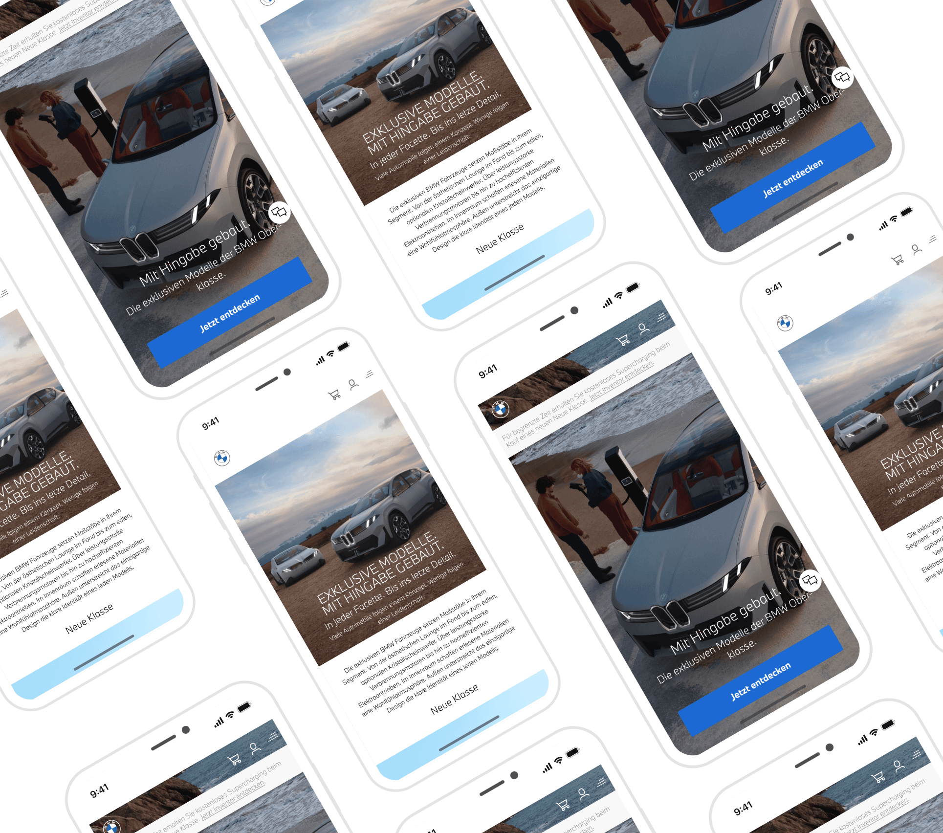
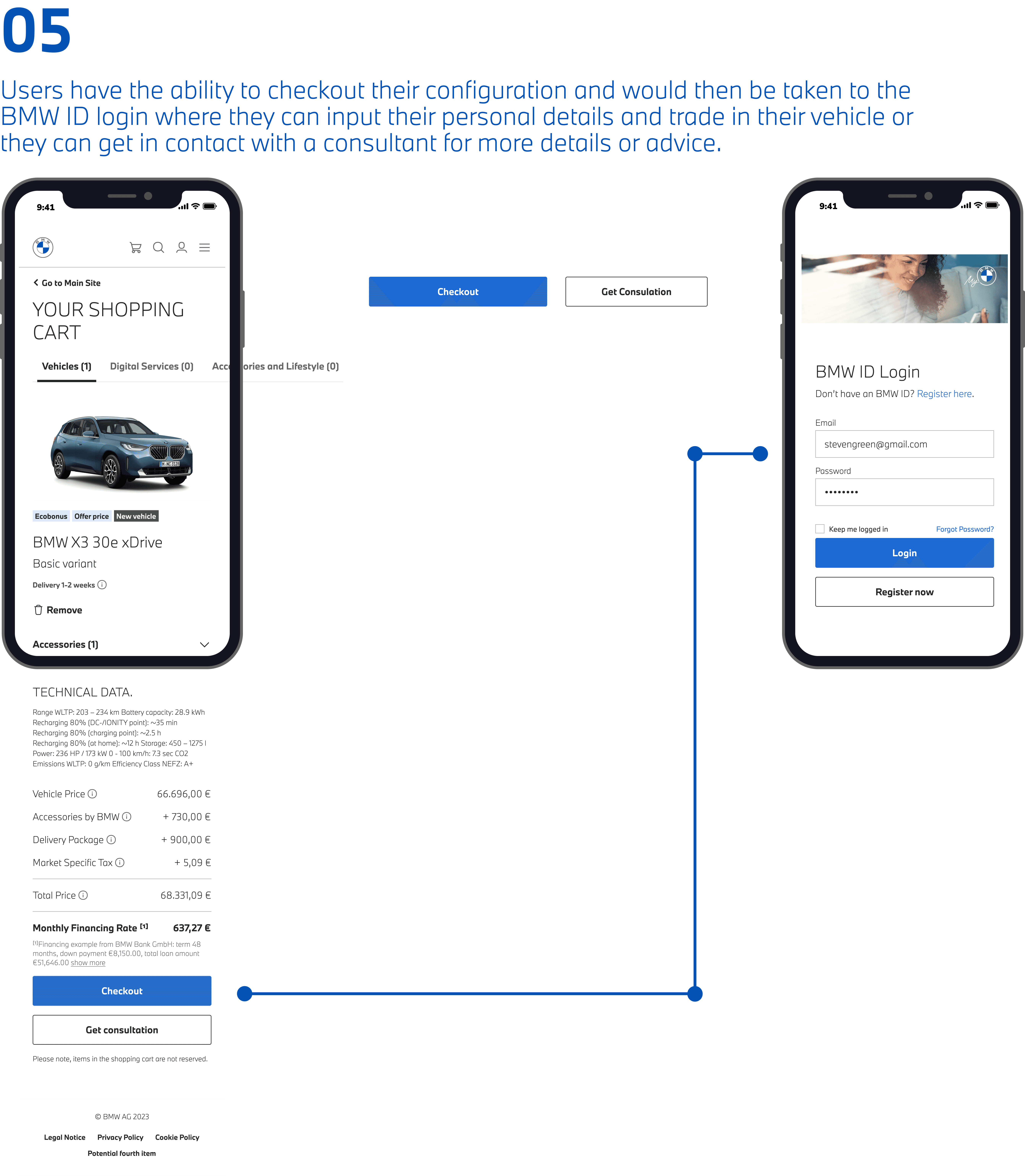
The core tension: BMW sells aspiration — but the configurator was creating anxiety. Users were building dream cars only to discover 6-month waits, hitting login walls mid-journey, and unable to compare options without creating an account first.
Through a heuristic evaluation and analysis of the live configurator experience, three critical UX failures emerged — each one a direct contradiction of the premium experience BMW promises.
A structured process ensured every design decision was grounded in user behaviour and business logic — not aesthetic preference.
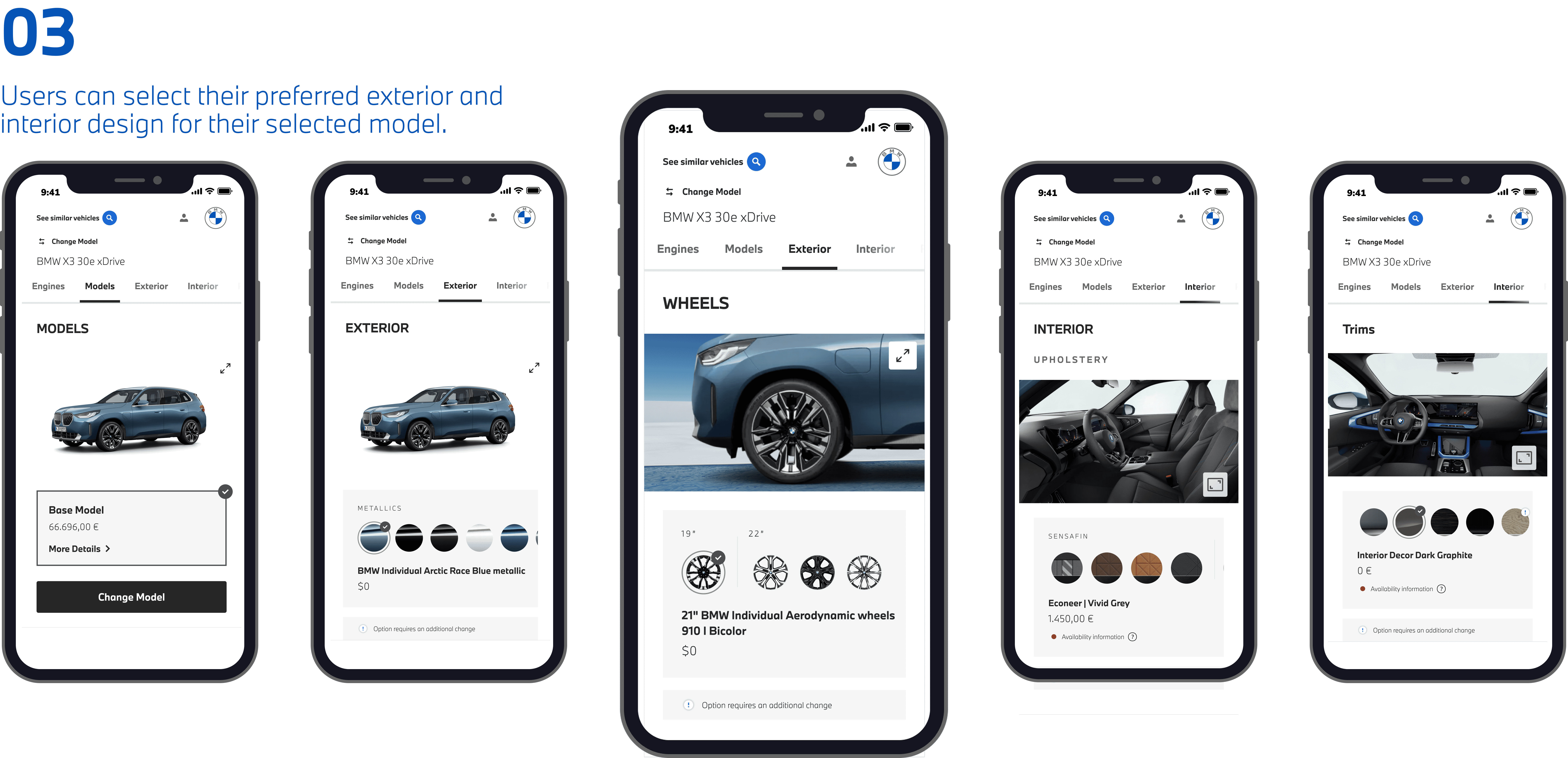
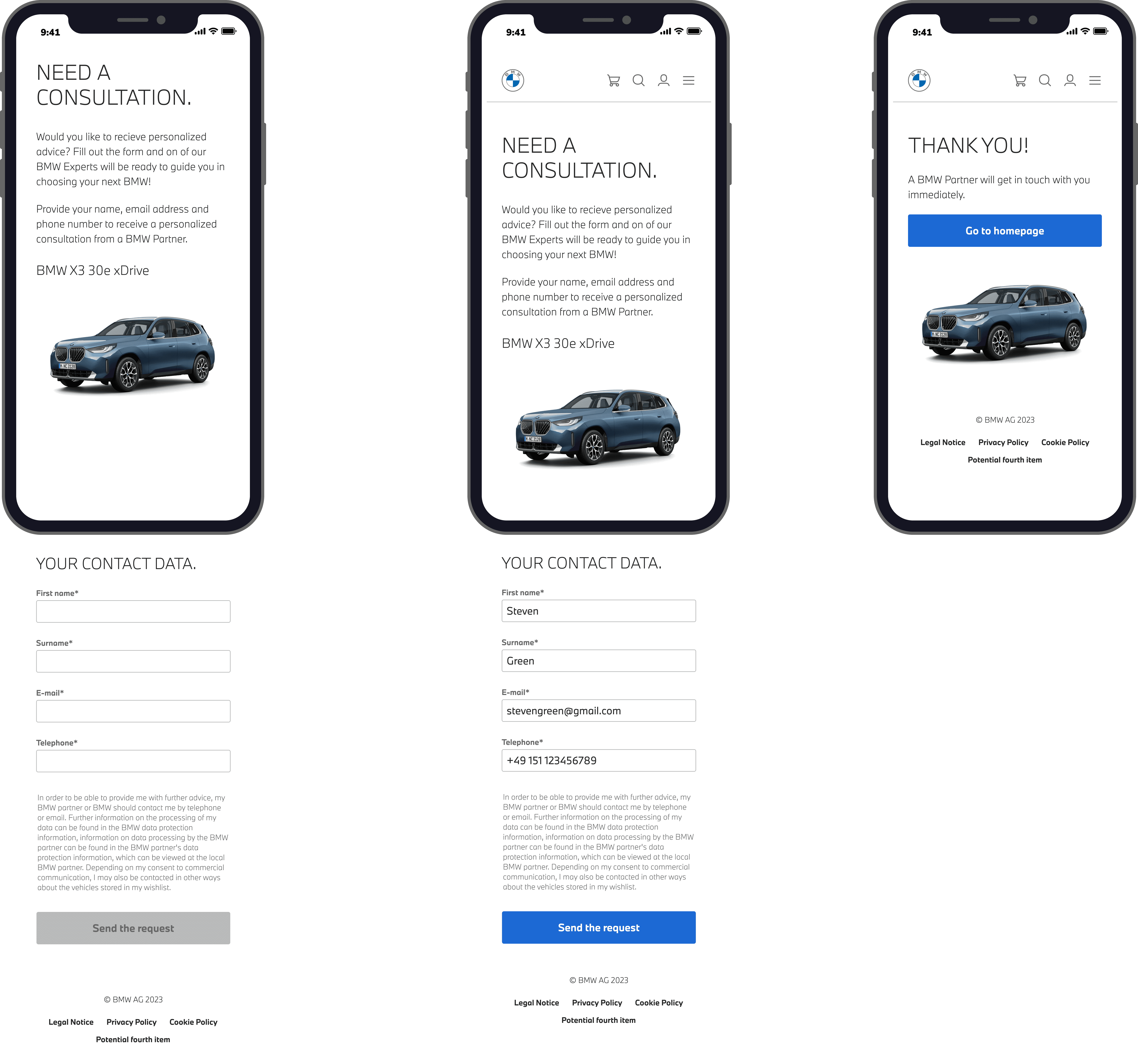
Each solution was designed to resolve a specific problem while contributing to a more coherent, premium end-to-end experience.
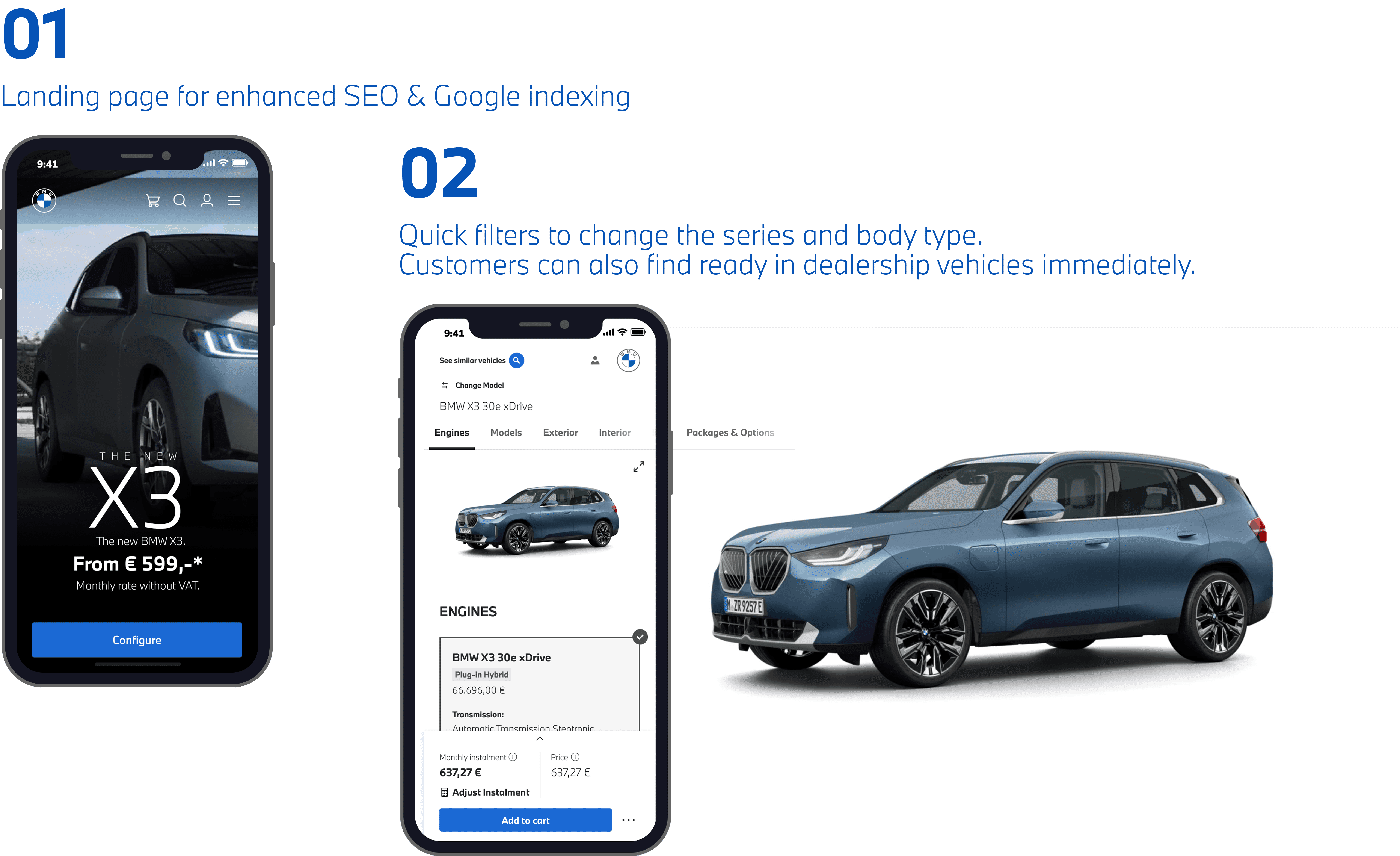
A contextual panel that surfaces ready-to-deliver vehicles matching 90%+ of a user's configuration — introduced at the point of highest intent, before the delivery timeline creates disappointment. Reduces perceived wait from months to weeks.
Delivery: 6 months → 1–2 weeksBMW ID login moved from mid-journey to the final step — after configuration is complete. Users focus on building their ideal vehicle first. Login becomes a natural save/share action, not a gatekeeping interruption.
Login friction: eliminated mid-journeyCompare up to three vehicles side-by-side with zero authentication required. Designed for the decision-making phase — giving users the confidence to choose before committing to an account. Comparison data persists via session storage, maintaining continuity even for guest users.
Login required: removed entirely for comparison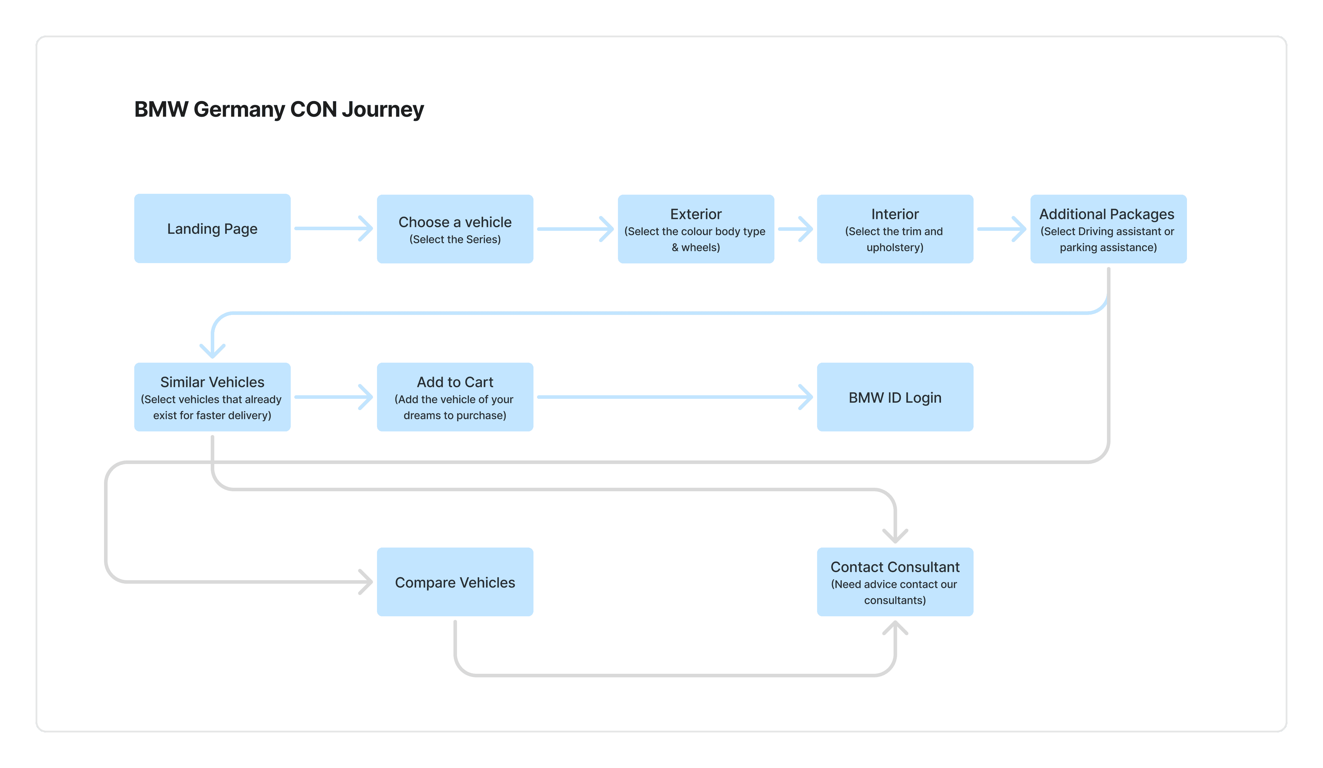
Senior UX design isn't about making things look good — it's about making deliberate, defensible decisions. Here are three moments where I made a conscious choice and why.
Honest self-critique is part of senior UX thinking. If this were a live project with full access, here's what I'd add.