A 10-floor building scan shouldn't end with a full day of waiting and manual work. Here's the strategy I built to fix it.
Enterprise UX · UX Strategy · NavVis · 2025
NavVis makes hardware that captures buildings in 3D. The hardware is fast. The software that processes the data afterwards was not. I was given a design challenge brief and 3 days to diagnose the workflow, identify root causes, design a solution, and plan how to ship it without access to users or engineering.
My Role
Solo Designer: strategy, UX, solution design, roadmap
Timeline
Hired challenge brief · 3-day time constraint
Constraint
No user access. No engineering input. Assumptions made explicit.
Why this case study is in my portfolio: This was a job application challenge. I didn't get the role. I'm including it because the thinking here: assumption mapping, three-option evaluation, self-directed SWOT represents how I actually approach strategy problems. The outcome of the hiring process doesn't change the quality of the work.
3 min read
01
The Problem
The hardware is fast but
the software treated every floor like a separate job.
NavVis's VLX scanner captures each floor of a building as a separate dataset. That's a hardware constraint and it's how the device works. But IVION, the processing software, had no way to handle multiple floors as a single job. Users had to wait for floor 1 to finish processing before uploading floor 2. Then wait again. Then manually combine all the datasets at the end, checking alignment, correcting errors, verifying the result.
The problem wasn't the scan time. It was everything that happened after the scan.
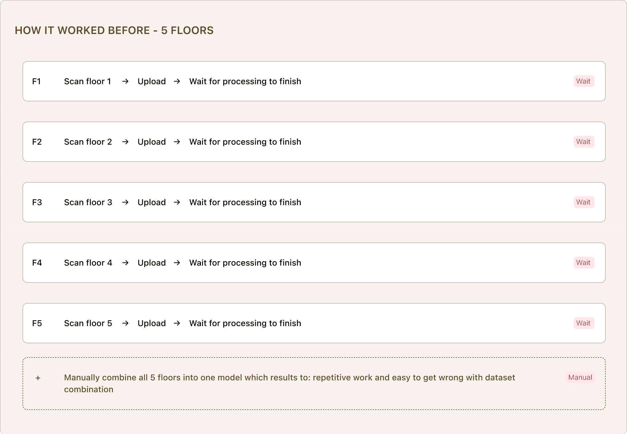
The root causes were two, not four. Sequential processing forced the waits. No auto-merge forced the manual work. The alignment errors and lack of status visibility were symptoms of those two root causes they'd be substantially reduced by solving the underlying workflow.
02
Starting conditions and constraints
We let the data
tell us where.
We used analytics tooling to map the exact drop-off points in the configuration journey. The data showed a clear pattern that users weren't leaving randomly. The majority dropped off after interior seat selection roughly halfway through the journey. This pointed to scroll fatigue rather than disinterest in the product. Users who made it that far clearly wanted to buy. The experience was losing them, not the car.
01. Scroll fatigue midpoint
Most drop-offs happened after interior seat selection not at the start. Users were engaged but exhausted by the endless scroll before they finished.
02. Login wall before value
Users were asked to create an account or log in before they could save or complete a configuration. On mobile, this killed momentum entirely.
03. Mobile experience unfit for mobile
taffic
The majority of configurator traffic came from social media = mobile users. The experience was built for desktop. Small targets, dense layouts, no thumb-friendly navigation.
03
Before And After
Same product.
Different experience.
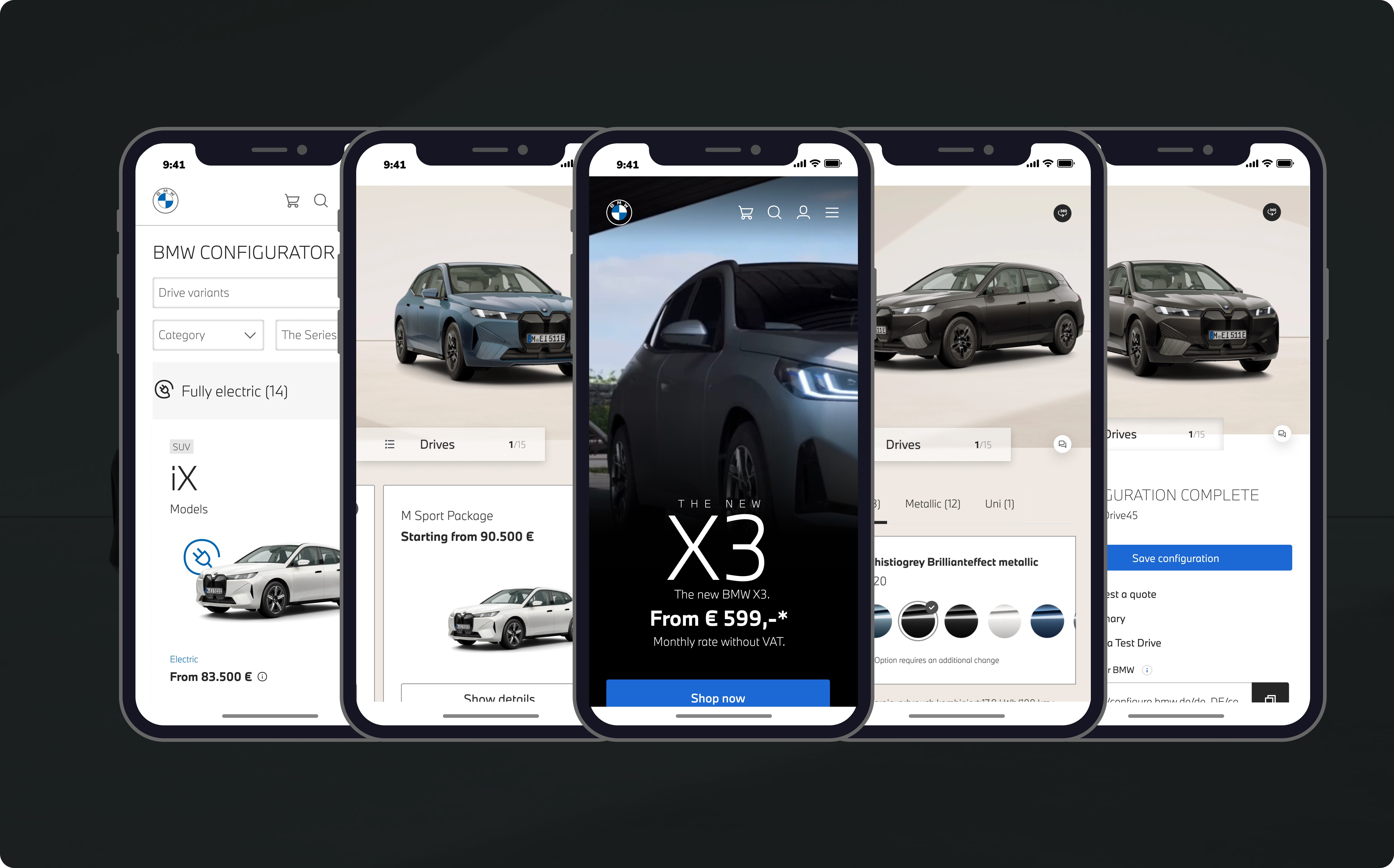
The old configurator treated every option as a list item in an endless scroll. No visual hierarchy, small imagery, dense text and no clear sense of progress through the journey. The redesign made the car the hero and large immersive visualiser, named steps with progress tracking and package cards that let users scan and decide in seconds.
Before - Old Configurator
After - Redesigned
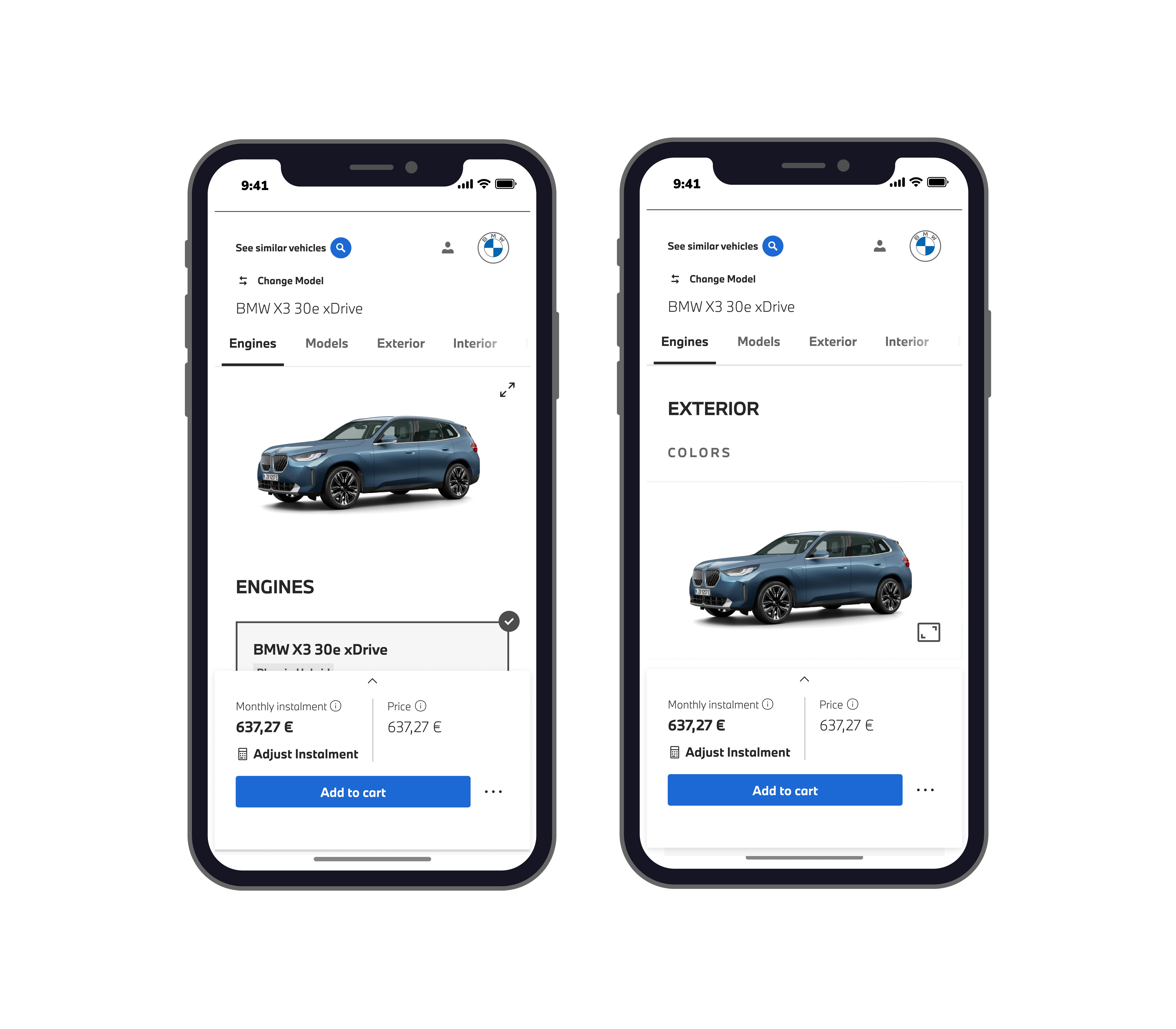
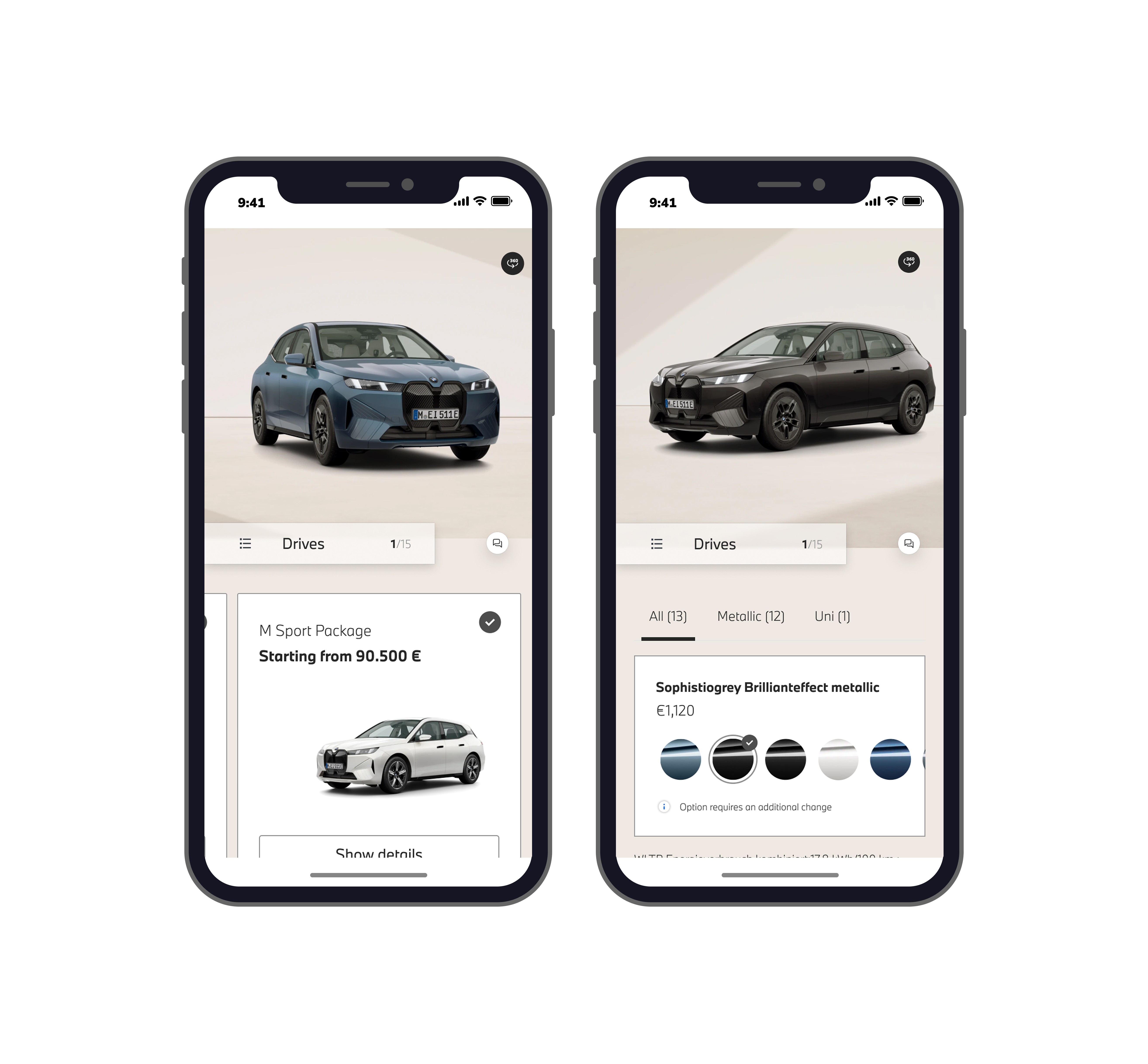
Dense list layout, small imagery, no progress indicator, options buried in scroll
Immersive car visualiser, scannable package cards, step progress (1/15), price always visible
04
Key Decisions
Two decisions that
moved the needle.
Decision One: Replaced infinite scroll with stepped navigation
The old experience was one endless page. We restructured into 15 named steps with clear progress tracking. Users always knew where they were in the journey and how far they had to go eliminating the fatigue that was driving the midpoint drop-off.
Decision Two: Made the car the hero on every screen
In the old design, the car was a small secondary element. In the redesign, a large interactive 360° visualiser anchors every screen updating in real time as users select colours, wheels, and packages. Users could see their car being built as they configured it.
05
Mobile-First Execution
Designed for the thumb.
Built for social traffic.
Because the majority of BMW's configurator traffic arrived from social media on mobile, every decision was pressure tested on a phone screen first. Package cards sized for thumb taps. Price pinned to the bottom bar so it never disappears mid-scroll. Colour swatches enlarged and spaced for finger selection. Step navigation accessible from a fixed bottom control.
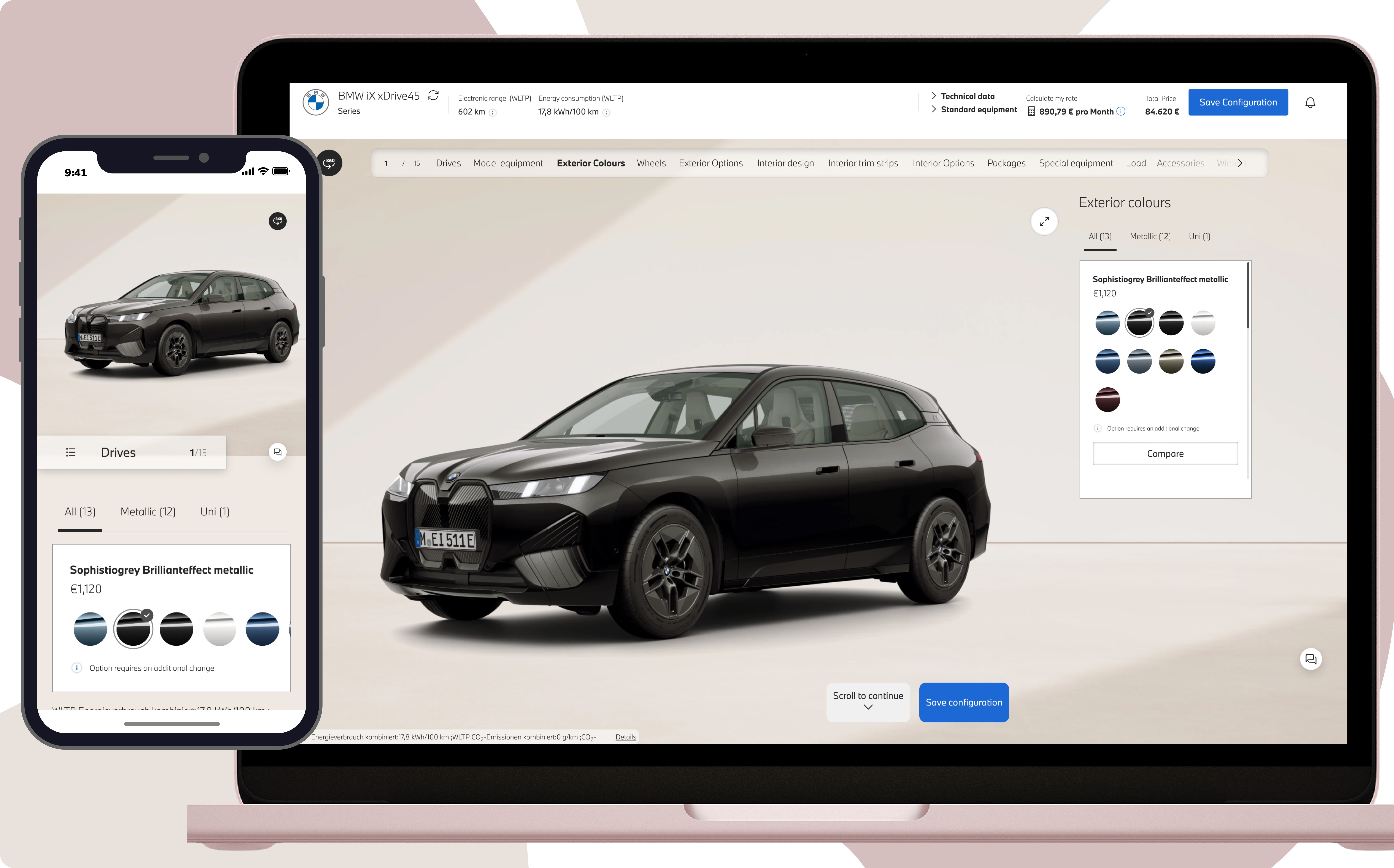
What changed on mobile specifically:
Package cards with car image and price. It is scannable in under 3 seconds instead of reading a text list
Step counter (1/15) always visible. Users know exactly where they are in the journey at all times
360° car view accessible with one tap. Users can inspect their configuration from any angle
No login required to browse stock models or compare making zero barrier for social media arrivals
Desktop experience with a large 360° car visualiser occupies the full left panel. Colour selection panel on the right with filter tabs (All, Metallic, Uni), large swatches and price updating in real time in the top bar.
06
Outcome
From drop-off to
completion.
The redesign addressed every identified drop-off point: scroll fatigue, login friction, mobile usability and lack of visual engagement and launched two new features that removed the barriers stopping social traffic from converting.
65%
Drop-off rate identified and addressed
2
New features launched stock visibility and comparison without login
4
Person team led as a senior designer across 2 mid and 1 junior
07
Reflection
What I took away
The configurator wasn't broken. It was exhausting. The data proved that 65% got halfway through before leaving. The job wasn't to redesign the product from scratch. It was to remove the specific friction points that were turning interest into abandonment.
Next Case Study
Getting 50 managers off excel and using internal tools
Sole designer tied in an engineering team. Ran user interviews, redesigned the tool from the ground up, and shipped 80% of the redesign despite scope pushback.
B2B
bmw gROUP
automotive
2024